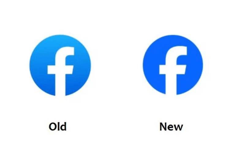
Have You Seen the Minor Modifications to the Facebook Logo?
You may have noticed a small change to the Facebook app’s distinctive logo if you’ve just opened it. The “F” emblem has seen a subtle modification, becoming larger and more intensely blue. This revision is part of a larger rebranding campaign by Meta, the parent company of Facebook, and comes with a detailed justification for these rather small changes.

The goal of this rebrand, according to Meta, is to stimulate seamless, self-initiated exploration and connection across all facets of the network. It is the first stage of a revamped identity system for Facebook. The app’s functionality has not changed, but some of its graphic components have been altered to reflect this goal.
Three main goals are outlined by Meta’s new design:
1. To develop a unique, updated Facebook, elevate the brand’s most iconic features.
2. Create a consistent presentation of the Facebook brand across all product and marketing experiences.
3. Create a comprehensive and eye-catching color scheme that is accessible and is focused mostly on the color blue.
The redesigned Facebook logo now has a more substantial and clearly distinguishable design, making accessibility stand out as the most significant improvement.
The flowery descriptions of these revisions that appear on Meta frequently utilize language like “a refreshed design that is bolder, electric, and everlasting” to explain their purpose. The focus is on creating harmony throughout the design, utilizing Facebook’s signature blue color in a more assured expression for better visual contrast and accessibility.
In addition to changing its logo, Facebook has also updated its color scheme and reaction emojis to elicit stronger feelings.
You’re not the only one who has observed that some areas of Facebook appear bluer or slightly different. Over the upcoming months, Meta intends to gradually implement these upgrades. So, you can relax knowing that Facebook does truly have a new appearance and not just your eyes playing tricks on you. This is something to keep in mind for future logo usage as well as website displays.


